Ethically Sourced
Gabriel White discusses working in Africa and grounding design work in ethics

Gabriel White is a user-interaction designer based in Santiago, Chile. His company, Small Surfaces, has provided design and strategy for such companies as dlight, Wave Money, Bridge International Academies, FrontlineSMS, and Ushahidi.
Frontier: Early in your career, you worked at Microsoft Research, Motorola, frog, and Punchcut. I imagine that many of the interaction-design projects you helped create incorporated bleeding-edge technologies. If so, what prompted your decision, around a decade ago, to focus on designing for low-income users without access to the latest and greatest tools and devices?
Gabriel White: The seed for my shift to social impact work was planted when I worked at Motorola. When I joined the Beijing studio, Motorola was starting a skunk-works project to defeat Nokia in Africa and India, to create a mobile phone designed specifically for customers in low-income countries. That was a light-bulb moment for me. I realized I could focus on different kinds of problems. That stuck in my mind, and after a few years in San Francisco, I decided I wanted to refocus my energy on these kinds of problems. There is value in designing for bleeding-edge technology, but it doesn’t solve basic problems for people. I wanted to focus on basic problems.
Frontier: How has being based in East Africa and then Santiago, Chile, not San Francisco, shaped your approach and the opportunities you receive?
GW: My partner and I left San Francisco for East Africa not knowing exactly what we’d do. I ended up starting a design-consulting business; it was an accidental beginning. At the time there was a lot of tech innovation in East Africa, especially in Kenya, but very little design talent. There was a lot of opportunity. We spent two years in Uganda and I built a base of clients, a portfolio, and a network of relationships. We then left Uganda, but I continued to work in Africa and elsewhere.
In terms of approach, nothing has impacted my work more than the rise of smartphones. They changed the wealthy countries, to some extent, but in low-income countries their effects have been orders of magnitude larger. People who didn’t have access to computers, or in some cases even access to electricity and running water, suddenly had computers in their pockets. They serve as a platform that organizations can use to deliver services and assist people. I help my clients do that.
But it’s also about developing local skills; in nearly every project I work on, I try to build the capacity of local partners. Eventually, I hope that my services are no longer needed. In 2010, there were two people in East Africa who had more than ten years of UX design experience. Now there are probably a thousand. That’s great: there is now a flourishing domestic design ecosystem there. So now I seek other places where my work can be impactful.
Frontier: In a 2013 lecture you shared some lessons these experiences taught you. One that stuck out to me is that “abstraction doesn’t work.” Some people would argue that design is a process of abstraction, of rearranging and clarifying a complex set of needs in order to achieve desired outcomes. Can you elaborate on what you meant?
GW: Using technology requires you to be technologically literate. You have to decode any designed interface. Conventions, patterns, signals, and symbols guide our interactions. Someone whose basic literacy is poor or low often does not have the skills of abstraction you develop while learning a language or through education more generally. So they face greater challenges when it comes to using technology.
To make that concrete: the old Nokia cell phones required a shift between the control buttons and the screen. As a user, I have to know that the up and down buttons move something on the screen; that the “enter” button selects the highlighted option. I need to abstract what I’m seeing and doing to be able to use the device. Smartphones, with direct-manipulation interfaces, were a huge shift for people with lower literacy levels. Suddenly they could directly manipulate what they wanted to change, which is far more similar to their everyday interactions with objects. It’s easier to use the smartphone’s visual language, to employ spatial reasoning and memory.
Another part of it is building mental models. When you click through a website, you’re unconsciously developing a model of its structure and hierarchy. You know to navigate “back home” to go to a different section. That mental model is totally learned; building up those mental models is a literacy skill. Using digital technology requires abstractions all the way down: the interface, the metaphors you use, the system’s structure, language itself. These create compounding effects very quickly: if you don’t have the confidence to solve these kinds of problems, small barriers quickly become roadblocks.

Frontier: In a more recent talk, you suggested heuristics as tools that can help designers incorporate the practice of ethics into their work. Can you talk about heuristics as frameworks or lenses, and about conversations you’ve had on this subject since that talk?
GW: This goes back to my university studies in philosophy; I’ve spent a lot of time thinking about design and ethics. In my current work, it’s a deliberate ethical choice to focus on the problems I do. I believe it’s good to focus on ways we can improve the world and make people’s lives better. One challenge is that 95% of the world’s designers probably don’t have the opportunity to work on “good” problems. Take digital banking, for example. A designer working on online delivery of financial services is definitely solving real problems for people; you’re helping them access their services. Beyond that, though, there’s a real sense that you have to park your ethical judgments.
It’s not easy, as a designer in most client or project contexts, to have conversations about what it means to create ethical products. A business might run social-impact projects, employ an ethics officer, but the overall culture isn’t suffused with or conducive to making ethics an important part of how they think about developing or offering their services.
In general, I believe the easiest way to integrate new ways of thinking to organizations through design is to focus on practical methods and tools; teach people the how. In the short term, you hope, they can see a meaningful result, and it’s a light-bulb moment.
I believe we need to take a similar approach with ethics. If you offer concrete, approachable methods that allow people to introduce ethical thinking into conversations, and to trace their effects through the work, I believe there’s an opportunity to make progress. In the same way that user personas were a powerful and simple tool for helping organizations focus on customers, I think an ethical toolkit can help people integrate ethical thinking in their everyday design work.
Ethics, of course, is about reflection, understanding, and values. But to make change in the practice of design, you need practical tools. Heuristics, as practical tools, are powerful in this context. They may not be ideal, but it’s the best way I’ve found to begin injecting ethics into those conversations.
Design as an activity has become user- or customer-centered. It took a few decades, but that value is now ingrained in just about every project. I hope that, in the future, the same could be said about ethics: the ethical way to build products will be embedded in every effort. It will just be how things work.
Frontier: We can’t not talk about the COVID pandemic, which, among other things, has forced a deep reckoning with our ways of working. Part of what you bring to any project is your on-the-ground experience in dozens of countries. Apart from not traveling, how has the past year changed what you do and how you think about it?
GW: Since we left Uganda, about ten years ago, basically all my work has been remote. So, in some sense, I was lucky and well-prepared.
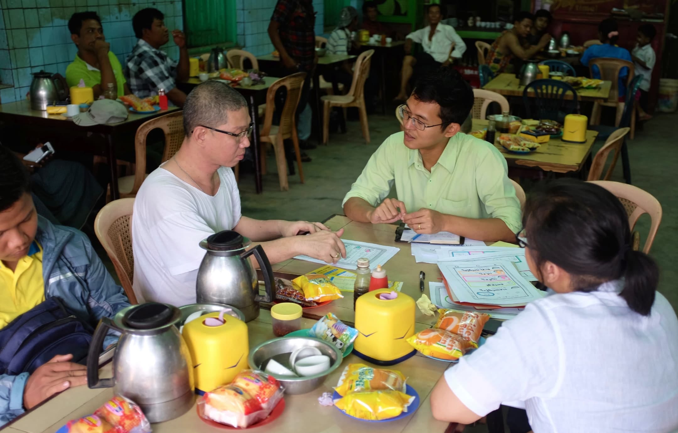
But, as you suggest, I haven’t been able to travel. I rarely facilitate fieldwork myself; culturally, and often linguistically, it’s better for a local person to facilitate. Local research teams can uncover insights and provide perspectives you can’t see as an outsider. But it’s become even more complex: for a current project in India, for example, the research team interviewed people remotely through Google Meet and then linked for me to observe remotely. It’s hard. People may not be tech savvy; the connectivity can be terrible. The physical environments often aren’t conducive: shop owners are often dealing with customers at the same time. It’s easier to manage that dynamic when you’re physically present. But everyone understands this is the way things work right now.
Frontier: Speaking more broadly, the pandemic caused many of us in higher-income places to move large swathes of life online, accelerating the presence of, for example, telemedicine, online shopping, or video communication. Would you say that the pandemic has exacerbated technological inequities because the haves can make these transitions while the have-nots will find insurmountable barriers to the same transitions?
GW: Yes. But I think the reason is not so much about having technology, but about how you live a productive life. I see that in stark relief here in Chile, where a large percentage of the population relies on work that requires being physically present. Chile is relatively affluent but still the pandemic has had a catastrophic impact. Most jobs here cannot be done online.
In low-income countries, it’s even worse, because such a small percentage of the population does knowledge work. Even if everyone has a smartphone, there's no way for them to suddenly become productive with the technology they have.
So people go out of their homes and work. They have no choice but to risk their lives to put food on the table. It’s all a challenge.
Frontier: Let’s conclude on a hopeful note. Can you name a few projects or markets that, in your view, have begun successfully addressing the challenges of designing for low-income contexts?
GW: Two areas come to mind. There have been amazing projects pertaining to maternal child health that employ digital tools to help expectant mothers be more healthy during their pregnancies. It’s a great example of using technology at scale, in many cases this is SMS messages for reminders, appointment confirmations, data sharing. But it’s also about understanding the context—in many cases these kinds of interventions have been successful because they included family members as part of the process. Technology and contextual understanding enables incremental behavior adaptation that leads to dramatically better outcomes.
But it doesn’t always have to be about nonprofits or governments. For example, new micro-payment mechanisms have enabled fascinating developments in off-grid energy. Buying a solar lighting kit for a home—a battery pack and lights—can be prohibitively expensive for many households. But if you put a SIM card in the kit and tie it in to a smartphone app, you can give that kit to someone and let them use their phone to pay small amounts every time they want to turn the lights on, or pay off the kit in monthly installments. Suddenly they have light whenever they want, and after a few years the kit is theirs. You couldn’t do something like that ten years ago because both solar and battery technology were too expensive or there were no easy ways to collect small payments.
The ground context is critical to understanding the problems you need to solve. In many cases solutions are interim and incremental, but the problems they’re solving are critical.


