Lots at Steak
Branding a biotechnology company whose product does not yet exist

On the one hand, Meatable is a Dutch biotechnology startup that has created a non-invasive way to grow harm-free meat. On the other hand, Meatable is a Dutch biotechnology startup that has pioneered a method of “reprogramming” Hematopoietic stem cells from the umbilical cords of cows so that they grow into muscle and fat in a lab setting. Which story would consumers prefer? For the London office of Koto, and ultimately for Meatable itself, the answer is the first option. But that was not the company’s initial approach. “When they came to us, their branding was intentionally scientific. They had failed to anticipate the Frankenstein factor associated with reinventing how food is produced,” says James Greenfield, Koto’s cofounder and creative director. “They wanted to begin dealing with the anticipated challenges around social acceptance and government regulation.” Arthur Foliard, a design director at Koto, adds, “The science is proven and can be shared with whoever wants to access it. We didn’t need to overdo it. Our aim was to focus on the positive impact Meatable has on the planet, because people can connect with that message on an emotional level.”
Meatable currently has a prototype that is measured in microns, not ounces or kilograms, and the company’s projections suggest that its first products will not hit grocery-store shelves until 2025. “From a branding point of view,” Greenfield says, “our first task was to position them as creators of a new category.” The key idea that emerged from this work is that of “the new natural.” From today’s vantage point, natural has to do a lot of work in that phrase. But the promise is that “what you’ll have on your plate in five or ten years is the same as the meat you get today. It will just be mostly produced in a laboratory,” says Foliard.
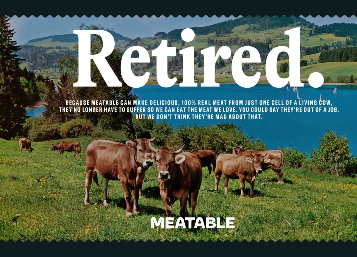
One question the Koto team asked itself is what happens to the animals when we are no longer raising them for meat? Thinking back to childhood trips to Switzerland, Greenfield concocted a story in which they retire to mountainous Swiss cantons. It’s slightly silly, but it helped drive aesthetic choices that Greenfield and Foliard both describe as “retrofuturist”: a brand whose look uses the visual and verbal strategies of 1960s- and ’70s-era advertising to communicate a future in which Meatable has created positive social and environmental impacts.
Some of the futurist comes from inspirations like the 2013 Spike Jonze film Her, which envisioned a near future that pulled forward and incorporated elements of the recent past. And a large part of the retro comes from vintage postcards; the Koto office collected hundreds. As Foliard describes it, they asked themselves, “What do these postcards have in common? They use frames, they use serif typefaces, they often have photos of animals in ‘natural’ environments like mountainsides. And, stylistically, they have a light-hearted spirit we wanted to portray. So we appropriated those elements and made them feel modern,” in the process commissioning several photographers to make new landscape pictures and staff portraits.
The 1960s and ’70s were also a golden age of witty, chatty advertising. (Think of Volkswagen’s famous “Lemon” advertisement.) The Meatable brand follows suit. It is “intentionally narrative in part because it has a lot of explaining to do,” as Greenfield says. “We wanted the company to have an opinionated attitude, to express themselves confidently about subjects that matter, like industrial farming and environmental impact,” Foliard adds.
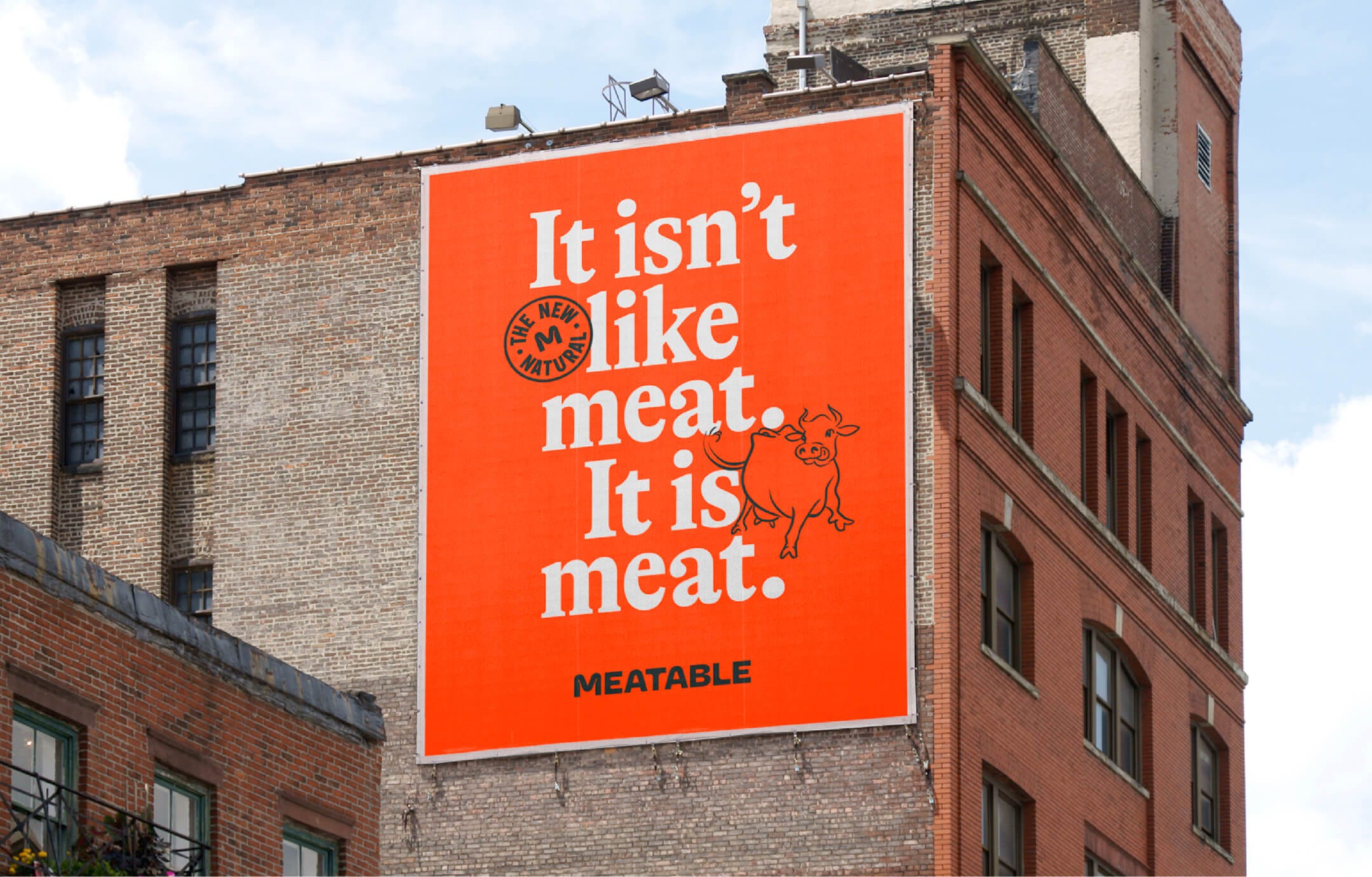
Part of that impact involves GT Alpina, a typeface with “perky details” and sharp angles. (That it was originally developed for a book celebrating the Swiss Foundation for Alpine Research is itself a subtle and cheeky reference to Koto’s animals-out-to-pasture story.) The typeface is superimposed atop these newly commissioned pictures, and often accompanied by a circular stamp that mimics the label on a package of meat you’d find in the refrigerator case.
“The whole thing is a balancing act: show enough of the science, but not too much; talk about the environmental impact but don’t pretend to be Extinction Rebellion; talk about the quality of the meat but don’t just show pictures of burgers and bacon,” says Greenfield. His team has created what appears to be a robust and flexible system for a company in its earliest stages. How that evolves as its products come closer to market remains, for a few years, an open question, and one that will be fascinating to watch.