Signs and Symbols
Designer Chantal Jahchan on the current revolution in Arabic type design
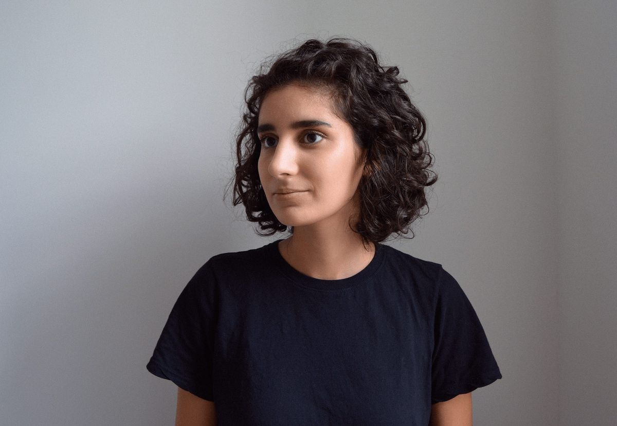
Chantal Jahchan is a graphic designer living in New York City who works at Pentagram and on independent projects. In this conversation, we discuss her recent projects, Beirut’s streetscape, and the current revolution in Arabic type design.
Frontier: I’d like to begin with one project you contributed to while on Eddie Opara’s team at Pentagram. Can you talk about the catalogue for Dawoud Bey’s recent exhibition at SFMOMA and the Whitney Museum?
Chantal Jahchan: SFMOMA first came to Eddie with a proposal to do a book for a retrospective called “Dawoud Bey: An American Project.” It was an interesting pitch: one book with many essays that was home to two very different photographic projects. Bey photographs African Americans and other marginalized communities with an eye toward representation and social justice. One series in the book is titled “Night Coming Tenderly, Black” and features nighttime landscape pictures of notable sites along the Underground Railroad. The dark, inky pictures place viewers in the position of someone who would have been fleeing the South during the nineteenth century. The other series is “The Birmingham Project,” which is a tribute to the four girls killed in the 1963 bombing of the 16th Street Baptist Church in Birmingham, Alabama. The pictures bring together kids who were, at the time the photographs were made, the same age as the girls killed in the attack, with adults who are the same age as the girls would have been had they lived.
Both projects play interestingly with time—with looking at the past and projecting into the present and future. Dualities are at play: dark/light, landscape/portrait. Our task as designers was, in part, to find the best solution to bring them together. Raoul Gottschling and I worked on this project together from the beginning; he carried it to the finish line beautifully once I left.
One interesting early idea was to make the book a gradient that ranged from darkness to light—as the reader progressed, the color of the pages would go from dark to light. It was a way to create a narrative that links past to present. In the end, though, we kept the series separate and punctuated by texts.
Frontier: I’d like to contrast that with another recent project that focuses on an artist who uses photography: your website for Farah Al Qasimi. As with the Bey project, the underlying grid structure is clear. But users can move images; those images often overlap; and there are other playful elements. Plus, you built the site, too. Can you describe what inspired you to “let loose” in this way, as well as how being a designer-developer allowed you to do things you might not have done if you had handed Figma files to a coder?
CJ: I looked directly to Farah’s work for inspiration. At the beginning of the project, we met up at her Bushwick studio, where I got to flip through her archives and discuss her practice as a photographer, artist, musician, and teacher. This type of open dialogue with a collaborator is immensely important to my own process because it shapes how I approach the work.
At some point during our conversation, Farah sheepishly handed me a zine she had made in 2019 to accompany her solo exhibition Arrival, noting that she was not by any means a designer. I fell in love with the cover, which was a floral print covered in stickers featuring educational English-Arabic phrases and imagery like butterflies and flowers. That got me thinking about the inherent playfulness of diaries and personalized spaces, and how those things might translate onto the web.
I also saw a parallel to the rich layering of color and pattern in her photographs, which often act like camouflage that the viewer must slowly digest. Likewise, the stickers and images on the site are layered on top of one another, and users can play with moving them around. Farah’s photographs are hidden by default on the home page and only appear once you hover over the project’s title. These interactive elements functioned as an invitation to enter her dream-like world.
Having to develop the site myself was not as limiting as I had expected it to be. In the beginning, in order to counteract the fear of implementing my ideas, I approached the design phase as if I were handing this off to someone else to build. It was the only way I could focus on the experimental functionality of the site without getting bogged down in the details of how to make it work. I did hate myself just a little bit when I got to the coding part, but it worked out alright after lots of trial and error.
In the end, we were both really pleased with how the work came out—which is not something I take for granted. We’re currently collaborating on a new project, which is a process I’m enjoying tremendously as well.
Frontier: Let’s revisit your origins as a designer. You moved to the United States from Lebanon at age four and your undergraduate thesis evolved out of an annual trip to Beirut to visit family. Can you talk about the thesis, which you titled En Route?
CJ: We made a family trip to Lebanon at the time I was beginning to think about my senior-year capstone project. I began taking photos through the window of my grandpa’s car, mostly of road signs and storefronts. I had just been learning about Swiss modernism and its emphasis on clarity, and in front of me was so much that I found beautiful but that flouted all the rules I had been studying. I didn’t really know what I wanted to do with the pictures at the time, but I knew I wanted to show people the beauty I saw.
I began interviewing people, including Arabic type designers Lara Captan and Wael Morcos, photographer Natalie Naccache, and my mom, who is an architect and who lived through Lebanon’s civil war, and found that modernity (typographic or otherwise) meant something different to everyone. So it became more interesting to turn inward and think about how Lebanon’s history has affected its typographic landscape and more broadly, its visual culture. The presence of multiple languages in spoken conversation and signage, for example, is a manifestation of the acts of healing necessary after the civil war.
Frontier: In a 2019 lecture you noted that Arabic type did not undergo the slow historical progression from calligraphy to serif to sans-serif that characterized the evolution of Latin type. Can you elaborate upon that?
CJ: There was a rupture in Arabic type’s historical progression. Put somewhat simply, the desire of Christian missionaries to convert people in the Middle East led to their simplification of the Arabic script so it would fit on their newly invented printing presses. The simplified, shortcut-laden Arabic that resulted from that political and technological conjunction held sway for centuries—on down to the present. I began to wonder, What if Arabic had been left alone to evolve from hand-written script into typography? And the pressing question is: now that we have the digital technology to re-create Arabic traditions accurately, should designers go back and “un-simplify” the forms or do we accept that the Latin phase is part of our history? It is this push and pull between past and present, innovation and tradition, that makes today’s Arabic type revolution so compelling.
Printed Arabic throughout the twentieth century was utilitarian. People who are teaching Arabic type now, I think, are focusing on experimentation.
Frontier: At the same time, there have been increasing efforts in recent years to think about non-Latin typography. This has recently resulted in, for example, Cyrillic or Hangul or Arabic-language versions of popular Latin fonts. One notable example is Lyon Arabic.
CJ: I think that a lot of the revolution in Arabic type has to do with young professionals, many coming out of Lebanon, who are pushing the status quo. Another big factor that drives this industry, like many others, is capitalist demand. When brands expand their markets into the Middle East, they often need Arabic versions of their logos. Some countries even have regulations that mandate signage be rendered in the local language. These and other reasons encourage existing brands’ leaders to Arabize their branding and type. That, in turn, pushes foundries like Commercial Type to make Arabic versions of their existing Latin typefaces.
There is nothing wrong with creating Arabic typefaces based upon Latin ones. However, it’s not healthy if that’s the only notable expression we see with Arabic type. You can respond to the need for fonts that pair with existing Latin families, but you also need to push the boundaries and definitions of Arabic typography.
Wael Morcos, who has been somewhat of a mentor to me, does incredible work on both sides of this divide. He co-created Lyon Arabic, which is the type of high quality Arabic typeface we don’t have enough of yet. But he’s also a brilliant brand designer who makes Arabic logos and typefaces from scratch. Some play into the language’s unique qualities, like its “stretchiness.”
Frontier: You’ve been raising money to support designers and others in Beirut after the horrible explosions on August 4. Can you talk about both what you designed and about the design scene in that city as you know it?
CJ: It’s not always my instinct to use design to respond to broader problems—or, in this case, to disasters. A day or two after the explosions on August 4, Everpress, a company I have worked with in the past on personal projects, asked whether I’d like to design a t-shirt as a fundraiser. Because they would donate all the profits and support it with their marketing muscle, I said yes. It was rewarding to be able to leverage my skills to make something that people might want, that could uniquely help a good cause.
I resorted to what I know because I had twenty-four hours to design it and get it online. I started by playing with a slanted calligraphic brush in Illustrator to nail down the general curves and angles of the word Beirut in Arabic. I tweaked the curves and placement, and then wove it together with the word in Latin. Had I had another twenty-four hours I would have decided I’m not a letterer and chosen an existing typeface. It’s rendered in a version of green that represents the cedar, the national tree, which symbolizes rejuvenation and life. We sold over one thousand shirts and raised more than $14,000 for Impact Lebanon and the Lebanese Red Cross.
Shortly thereafter, at the invitation of Femme Type and Adobe, I designed some stickers to raise money for Studio Safar, a wonderful design studio based in Mar Mikhael, which is one of the hip, art- and design-filled neighborhoods in the city—like the Brooklyn of Beirut.
Frontier: Can you name some other Lebanese or Lebanese-American studios and designers—or recent Arabic-language design projects—you think deserve wider attention?
CJ: I have mentioned Wael Morcos and Studio Safar. I’d also add Tala Safié, who is an art director at the New York Times and in 2016 completed a thick, beautiful book called Tonight, which presents a rich archive of Lebanese movie posters. It’s bilingual, so it has interesting type-setting. Nadine Chahine recently developed Font Li Beirut, a font in which each character is made by a different designer and which also serves as a fundraiser for the Beirut recovery efforts. Lastly, I must again mention Lara Captan, who is actively teaching Arabic type design internationally with Kristyan Sarkis and developing typefaces. She was a big inspiration for my thesis: seeing her talk at Typographics 2017 was earth-shattering for me, it brought together, for the first time, two parts of my identity that I had always compartmentalized. She also sparked my interest in Arabic type.


