The Frontier Interview: Jake Dow-Smith
On the web’s needless complexity and translating signals from one medium to another

Hi everyone,
For this issue, I spoke with Jake Dow-Smith, a web designer who launched his own studio a little more than a decade ago and whose designs have a streak of experimentation that enhances rather than constrains the user experience. I hope you’ll find our conversation as galvanizing as I did—it made me want to brush up on my HTML and CSS. You’ll find an edited and illustrated transcription below some takeaways and this issue’s batch of links to other good reading.
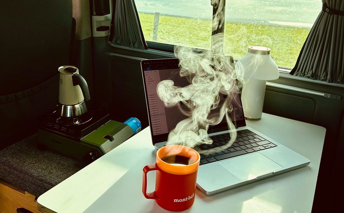
While I was prepping this introduction, Dow-Smith launched a one-page site with such a fun premise: move your mouse, paint with emoji, reveal the text. So simple and sweet.
What are some great sites you’ve seen lately? Reply and I’ll compile some favorites into next issue’s Good Links.
Until next week,
Brian
Some takeaways from this week’s interview
- You can just Publish Something Online. Today it’s possible to run complex apps in a browser, but the basic principles of the 1990s can still get your ideas in front of the whole world.
- Digital experiences should reflect real-world values. Treat your online visitors the way you’d treat people in person, and they’ll reward you with their attention and trust.
- Introducing a little friction can be a good thing. In web design, smooth and seamless, which can be good characteristics, too often come off as boring.
🔗 Good links
- 🌬️🪟 On the urgency of (architectural) stewardship: “The issue of comfort seems to have placed us in a vicious cycle of seeking out the next innovation in sustainable-but-comfort-producing technologies that bring with them yet more matters to care for…. It is high time to turn the equation around.”
- 🛣️♻️ The next phase of Inner Loop redevelopment in Rochester: “What impacts have these highways had on communities? What can be done to reverse that? How do we heal wounds and restore trust?”
- 💧🇲🇽 I’ve written in passing about my concern about urban water crises. Here’s a new report from Mexico City: “A grim convergence of factors—including runaway growth, official indifference, faulty infrastructure, rising temperatures and reduced rainfall—have left this mega-city at a tipping point.”
- 💕📚 To remake the publishing industry, “How much can the model that has enriched [romance writer] Colleen Hoover and Sourcebooks be extended to other forms of writing?”
- 🌎🍂 Published one year ago this week: On NDN Collective and an Indigenous systems approach to the climate crisis.
The Frontier Interview—Jake Dow-Smith
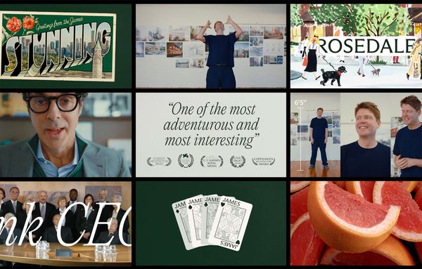
One sign of a great designer is that you can recognize their spirit in work you don’t yet know is theirs. That’s not the same as a designer with a patented aesthetic. Instead, it’s a telltale approach, something you might even label a philosophy. What I think unites Jake Dow-Smith’s websites is an emphasis on creating new, fun interaction patterns out of our IRL environments or our humdrum habits like scrolling and clicking. Whether it’s older projects like Torque Editions or newer sites like Los Feliz Engineering and Felicia Honkasalo, his designs meet the expectations of his clients—artists, nonprofits, creative companies—while cheerfully refusing to meet ours as viewers.
I spoke with Dow-Smith last week about the web’s needless complexity, “luxury” web experiences, and translating signals from one medium to another.
Brian Sholis: Can you describe the first webpage you published online, and then the first webpage you created and published as a creative act that uses the web’s unique properties?
Jake Dow-Smith: I’m thirty-seven now, and I made my first website when I was thirteen. I made it in Microsoft FrontPage. I was really into cycling as a teenager, and the page was a kind of aggregated cycling network. It was actually online as recently as two or three years ago!
Back then, I wasn’t allowed to buy a domain or hosting, and I didn’t have a debit card. But there were services that offered free hosting, so I used it to make dozens of little websites, publishing stories. At one point I made a tour of my mom’s house. Being able to publish, talk to people using chat rooms—it opened a world to me.
BS: Did that cycling network site bring you into contact with other enthusiasts?
JD-S: Oh, no—no one saw it except me, I think. Back then there was no way of saying, “Hey, I’m here! I’ve made this website!” People would’ve had to stumble across it. That’s probably for the best! The other day I found, in the Internet Archive, a blog I had when I was seventeen. It was full of teenage angst. I’ve left a lot of traces on the internet; every now and again I remember another and have a look.
BS: And to return to the other part of that question, about being self-conscious about creating something for the web …
JD-S: I’m not sure I can remember the first of those. But do you remember the Million Dollar Homepage?
BS: I do!
JD-S: That project opened my eyes. Selling pixels on a screen was crazy! But it showed me the internet doesn’t just have to be documents on a screen, it could instead be interactive in exciting ways. Anyway, apart from that tour of my mom’s house, which I built with Microsoft Bob and was skeumorphic, I’d probably cite my photography blog, called Triangle.
BS: I see this followup question as related to the first one. Your current website’s code, as well as that of your client projects, is not “minified.” Can you explain what minification is and why you deliberately avoid it?
JD-S: I’m a firm believer in the K.I.S.S. principle—keep it simple, stupid. Web development has become horribly complex and inaccessible to people who are new to the practice and trying to explore what it is and what it can be. When I was making my first commercial websites, I learned how to accomplish something by looking at the source code of another site and seeing how that’s made. Minifying your code closes that off.
More generally, I feel there is an increasing amount of gatekeeping around web development. Egos are involved in programming languages and frameworks. The output of many of these frameworks can be even harder to read than minified HTML or CSS. So my choosing to not minify is deliberate. I think it’s important that people can still access and understand my work, that it’s not just machine-readable but legible to anyone interested.
BS: I think of your work as being legible in another way: although your sites often introduce unique interaction paradigms, once a user “gets it” the whole experience becomes very clear. That ability to sneakily get people using something different and memorable leads me to ask: what are most designers not taking advantage of on the web, both in terms of what’s technically possible and what web users are capable of assimilating?
JD-S: I would say that I tend to use the browser as a canvas. I especially like to use something common and turn it into an alternative interaction. What can I build that responds to simply moving the mouse, so that you don’t even have to click to get around?
Web design has been consumed by product design, in the sense that it has conformed to the business imperative of optimizing for conversion. Everything is sleek and meant to get people to click specific buttons. Conversion is not a metric for success that I want to use. You’ll also see trends emerge from one successful redesign and then ripple out across the industry—
BS: How, for a while, every digital product took Linear or Vercel as its starting point …
JD-S: For sure. That kind of groupthink is probably why my work has been able to stand out more. I stick to my guns.
BS: You’ve never run an A/B test? [Laughs]
JD-S: No, I haven’t. And why shouldn’t, for example, an e-commerce website for a luxury brand reflect the experience of shopping in one of its retail locations? If you walk in to a store, the salespeople aren’t going to pop up into your field of view and ask you to join the email newsletter every two minutes.
BS: I take that point, and am also curious about your independent experiments and how they feed in to your commercial practice. These self-initiated projects vary: you made a graphic design brief-builder for students; you made a website that displays a random picture from Wikipedia; you made one that converts the visitor’s geographic location into a colorful gradient; you have one that divides the space you click in half.
Do these experiments find their way into your other work practically, or psychologically, or in both ways?
JD-S: I’m still really passionate about what I do. I’ve been doing it for a long time, commercially, but I still have the drive to experiment, to work with content in different ways, to translate one kind of data into another.
These experiments stick with me for a long time. Location as a gradient is something I made about ten years ago. I’ve been thinking about it since, and only recently could I apply its main idea to something I was working on for a client. So I guess you could consider my experiments research, in a broad sense. But it’s research for projects that I don’t yet have.
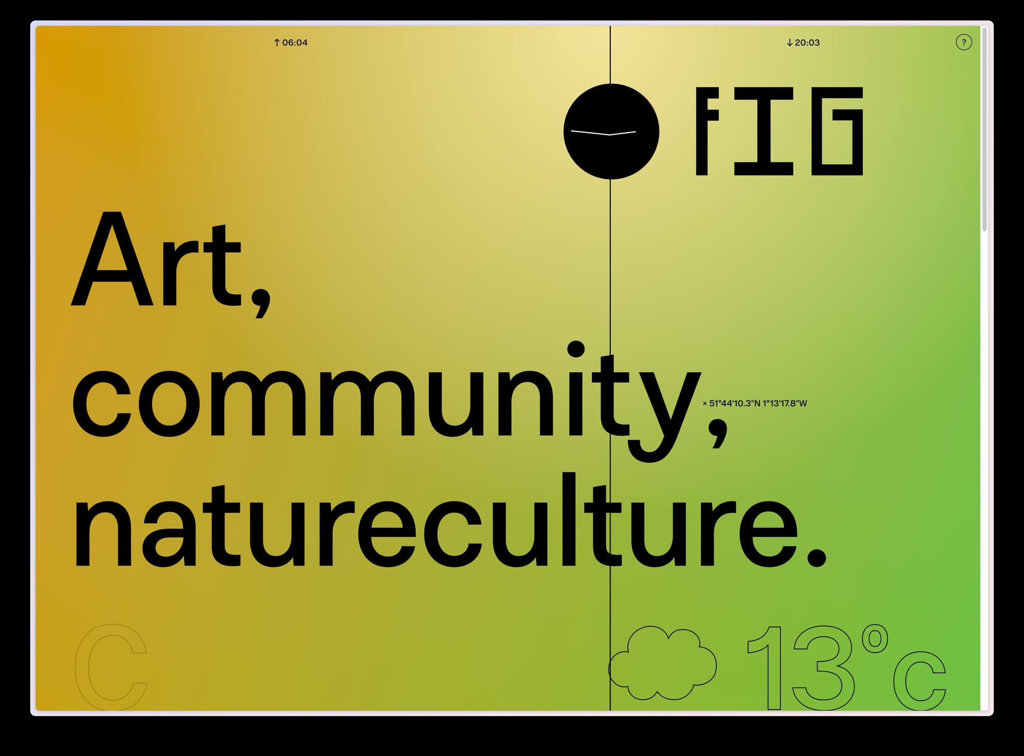
BS: That translation you mention—it seems to me that you’re often trying to translate something between the real world and the online world. A website you designed for Fig Studio in Oxford, England, response to the weather and astronomical conditions in Oxford. When I visited this morning it was blurry because it was raining outside.
The two worlds—online and “IRL”—are so inextricably woven together. But, for example, the Apple Vision Pro is a different manifestation of that merging from your site for Fig Studio. What values do you want to hold on to as these two “spaces” become even more seamless?
JD-S: Let’s start with the point about rain and the Fig website. There are “immersive” weather apps for the Vision Pro that make it seem like it’s raining in front of you. But who would want that? I understand wanting the data, but not having it look like it’s raining in your living room.
More broadly, I’m still confused by the fact that in the Vision Pro, you still use apps that are 2-D representations. You browse a Safari window. It’s just that the 2-D plane is hanging in front of you.
BS: And your approach, instead, was to break conventions, to impose real-world conditions upon the virtual environment, which would otherwise be presented in a kind of vacuum. Whereas the Vision Pro abstracts away the real world. I feel there is an ethical choice in reminding people, as you’ve done, that these virtual worlds we create are both subservient to, and literally made from, stuff in the real world.
JD-S: Perhaps it comes from being out in nature—most often hiking and cycling—is such a big part of my life. I grew up in London, but live in a village surrounded by sheep. That was a choice, and perhaps my interests come through in digital form.
I love translating signals from one form to another. One of my favorite stories is of the scientists analyzing the earliest data they received from space. It was graphed on a huge plot chart. They were looking for anomalies, but couldn’t find many—so they converted the chart to sound and listened instead. Because ears are more sensitive and your brain can process that information more easily, they could find what they were seeking. I love how translations completely alter experiences.
BS: Returning to the conversation about product versus web designers: maybe one way of analogizing it that, similar to how English is increasingly the “global language,” conversion-optimized “product design” websites are a digital lingua franca. Therefore the value you derive from learning a second language, being able to express yourself in multiple ways, can be applied to digital contexts, too.
JD-S: I like that. A big part of my design approach is to introduce friction. Not as an irritant, but to slow people down. I believe if you do that, then reward people with a novel experience, they’ll spend more time looking at what you want them to look at. The visit durations on my newest site, for the nonprofit Apossible, surprised us; people are spending three or more minutes on a site that, at launch, was basically two pages.
BS: We all assume people are fickle, that they’ll click away or close a tab or switch to another app; I appreciate your faith that we aren’t. As a final question, I want to revisit something you mentioned in passing a few years back, that you think the internet should have a speed limit. What did you mean by that?
JD-S: It’s tough to recall, but I suspect it relates to this notion of time and friction. Constraints enable creativity. What if you could only visit ten websites a day? What qualities would you look for in those sites? What if every website you visited removed a pixel from your phone? How would that rearrange our habits, rewire us to enable new kinds of perception?
Since becoming a parent, and especially after the COVID pandemic, I have come to think that things should just … be slower. It’s a real yearning I feel, and I believe others feel similarly. What does that look like when applied to the internet?